Unveiling the Meaning, History, and Evolution of the Barbie Logo
The world of toys is like a magical storybook, each toy has its own magical story and each chapter of the storybook is so exciting and enchanting. The bookmarks to all these chapters are always identified with beautiful and in-depth logos each toy carries.
Ever imagined how crucial a logo journey stays along with the toy journey let us understand and explore one charming chapter of this magical storybook the Barbie logo. Hearing the word Barbie, a flash of emotions comes in front of us no matter which generation we belong to whether you are a kid or an adult barbie opens up the imagination world for us.
A doll known as the symbol of creativity has its unique symbol to identify the Barbie logo if you want to understand the history, meaning, and evolution journey of the Barbie logo. Don’t worry you are in the right place. Presenting you the beautiful Barbie logo world, because the Barbie world is something we are all familiar with now it’s time to get familiar with the Barbie logo world.
Barbie Logo’s Meaning
The person who created the Barbie doll toy created its original Barbie logo too in the year 1959, was Ruth Handler a strong independent, and fierce woman bringing the same intentions into her toy as well as its logo, so Barbie was a symbol of diversity, fierceness, empowerment, self-expression, and inclusivity these things were reflected in the Barbie logo.
Logo Barbie conveys several meanings be it a sense of fun, elegance, glamour, or sophistication it is somewhere related to the potential related to a modern woman as the logo Barbie comes in the color pink it was back then a symbol of femininity, opening the world of possibilities and imagination so Barbie and logo barbie was symbolized as the freedom to express and explore the imagination ideas as back in the mid 19’s to give such status and symbols to woman as difficult but Barbie proved that wrong.
Barbie’s History
In the early to mid 19’s when it came to dolls, an image was portrayed as a clay doll. Wooden dolls or even paper dolls were designed for children and infants and dolls were also in the child version and it was a kind of stereotype being followed. But when Ruth Handler observed her daughter dressing her dolls as adults instead of kids a breakthrough came into Ruth’s brain to create dolls that are adult-looking dolls and playable by kids.
So considering this event Ruth named the doll after her daughter Barbara and Barbie’s full name is also Barbara Millicent Roberts, so just like humans dolls should also have a nickname, That is where the Barbie doll comes into the picture a blonde fashion doll with multiple fashionable attires, the doll even faced racism because it was blonde and in white color, some people said it gave a sexy appeal because of its fashionable attires so it was also customized in terms of clothing and skin color of the doll as per different people and its culture. It has its controversial success comes with all its upward and downward ladders.
From this, we can say Barbie made an impact on the toy world, but so did the original Barbie logo, but the story doesn’t end there the famous “Logo Barbie” has evolved over a journey adding to 60 plus years. So here we go into the logo world.
Evolution of the Barbie Logo
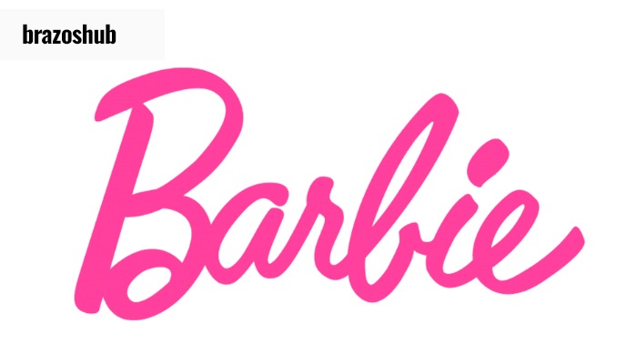
First and Original Barbie Logo 1959 to 1975
The style of the first logo was made in handwritten style and pink color, it had a unique and cursive font. When you closely observe the Barbie logo font it represents a playful nature as the letter B is larger than the rest of the letters, the a and r letters are in the upward direction, and the rest letters are in the other direction representing a distinctive nature.
To get a clear idea of the context here is the first Barbie logo png
1975 to 1991
The 3D version of the Logo: This logo represents a significant change from the previous one, as in these years the Barbie doll adopted a modernized look so the logo had to transform to a modernized look with the 3D logo, the color was same in pink color, but barbie logo font color was white here first letter B is capital but a change was observed as compared to the original Barbie logo all the remaining letters are seen uniformed. One more thing was observed the logo was slightly in the upward direction and individual letters didn’t have a shadow but a dark shadow was observed over every letter in the logo as a whole.
Check out the Barbie logo PNG and compare it with the Barbie original logo
1991 to 1999: Barbie Logo as Flat Logo
The 3D logo of Barbie was kept for 16 long years but as change is something we all look for so did Barbie now the logo was without shadows or the 3D effect but was a flat logo, there were few changes in the barbie logo font has it has some curves but overall the letters were straightened and the font color was kept as pink.
Check out the flat Barbie logo PNG
1999 to 2004: Comeback similar to the original Barbie logo
This logo was similar to the original Barbie logo, but the same cursiveness of the logo was slighted upwards with a slant and the color of the Barbie logo font was a bit brighter. The letter B and the cursiveness in this are a bit different from the original logo. In the original Barbie logo PNG, the letters an and r are connected whereas here you can find space between the letters a and r. which gives the logo an overall rich look with originality.
Here is the 4th version of the Barbie logo PNG
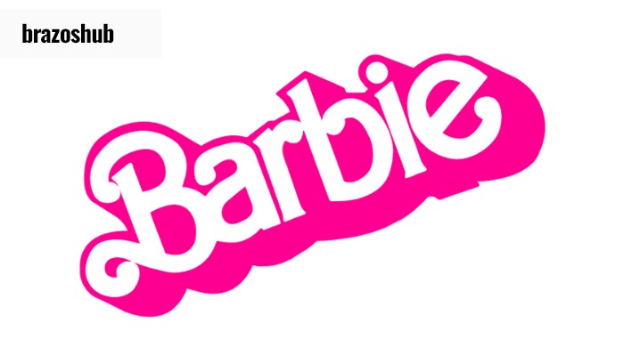
2004 to 2005: Addition of the flower icon:
The short-term years logo now had a flower icon with five petals in the replacement of the dot on the letter i, it somehow represented an aesthetic design, to make the logo relatable to children with a playful nature, overall it gave the logo a distinction with this flower.
Check the flower Barbie logo PNG
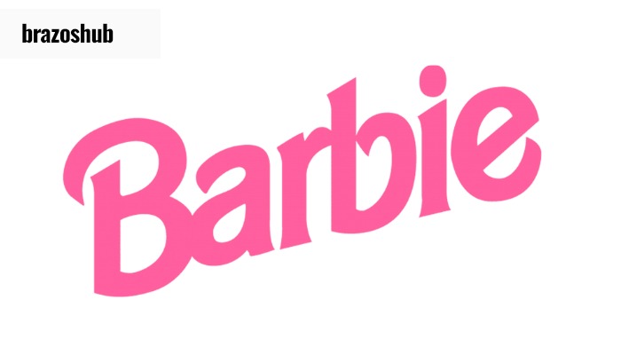
2005 to 2009: The flower paid the price
The logo couldn’t survive for a longer time and the flower was the reason, so now the Barbie logo fonts had to keep the letter i as it is, and more or less it looked liked the fourth version of the barbie logo as it had a lot of similarity with the cursiveness from the 4th version and was straight in line rather than slighted and upwards, different from the barbie logo culture the straightness and the color was a darker shade of pink. Overall this logo represents that it’s not limited to the child segment as the doll came with the concept of the adult looking like a doll.
Barbie Logo PNG of the sixth version

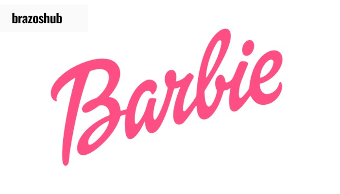
2009 and continue till today
Jumping Back to the first and original Barbie Logo: Strange right? For a logo that has an evolution cycle of more than 60 years, going back to the first step towards the logo journey to the 1959 logo with the soft pink color palette and playing the relevance card with this logo was a symbol of continuity and connection to the roots. Hence after trial and error for now the first logo and last logo stay as the original Barbie logo.
Original Barbie Logo PNG
The evolution of the Barbie logo has its own different story and new learnings in each logo period, but there are a few other elements associated with it that are always underscored, These elements are in some or the other way related to the Barbie Logo.
Barbie Head Logo
Along with the original Barbie logo there is a doll head kept right above the letters a and r and it with a ponytail, neck shape, and eyelashes that sync perfectly with the logo, and the logo identity of the doll is known as the barbie head logo. The Barbie logo head is simply a symbol of elegance.
Colors
Pink Color
Each color has its meaning and it takes a lot of time to reflect this meaning with a brand and its logo. So Barbie did the same it utilized the color pink in the Barbie logo head and the Barbie logo font is kept in pink, which was color related to the gender originally barbie had dolls and the target segment was women children, and girls, later on, entered the male dolls hence the pink color for the barbie logo font was kept because of the color that represented feminity.
Pink color for the logo font is named as Pantone 219 C also known as Barbie Pink, Pantone 238 also known as Baskin Robbins and Pantone Process Magenta which is also know as Lilly Pulitzer Pink.
Source: Pantone, The Template Emporium
Black Color
Yes, the Barbie logo font did have a black color as pink cannot be matched with every packaging so black color in the Barbie logo font was used typically for the original Barbie logo so that the logo stands out in some colors packaging.
Fonts
Barbie Logo fonts are hard to match with existing fonts universally, as it was said it is handwritten and looks cursive, there was the usage of technology in the fonts, some may say it may look similar to the font Brush Script std Medium and San serif font might be used when creating few versions of the logo.
Be it the Barbie doll, Barbie head logo, the fonts and colors of Barbie it is tradework and beautiful creation as unique as the doll itself. Barbie creation has created wonders so has its logo.
In Summary, as the Barbie doll went through so many versions, dressing it to different cultures every three to four years there was an outstanding version of the Barbie Doll so it is important enough to match the brand identity with each version and to have a global impact Barbie logo required modifications and in 60 years Barbie logo’s played a crucial role when it came to Making an impact in the market or standing out from the competition which teaches us just the way a storybook teaches or explains us a lesson change is essential and instead of being rigid we can be flexible enough to adapt to environment just like the barbie logo did.
But in the end, it also teaches us to stay connected to the roots just the way the original Barbie logo did, Barbie stands out today with the doll and the logo. Keep imagining the next strategic move of Barbie be it the Barbie logo, Barbie logo head, barbie logo font, and even the doll it is the storybook chapter, and the future is open to Barbistic imagination.